The following plot uses (distorts) the country sizes to represent the worldwide population. What kind of visualization (map) is this plot?
- Cartogram Heat map,
- Robinson map,
- Winkel map,
- Choropleth,
- Cartogram,
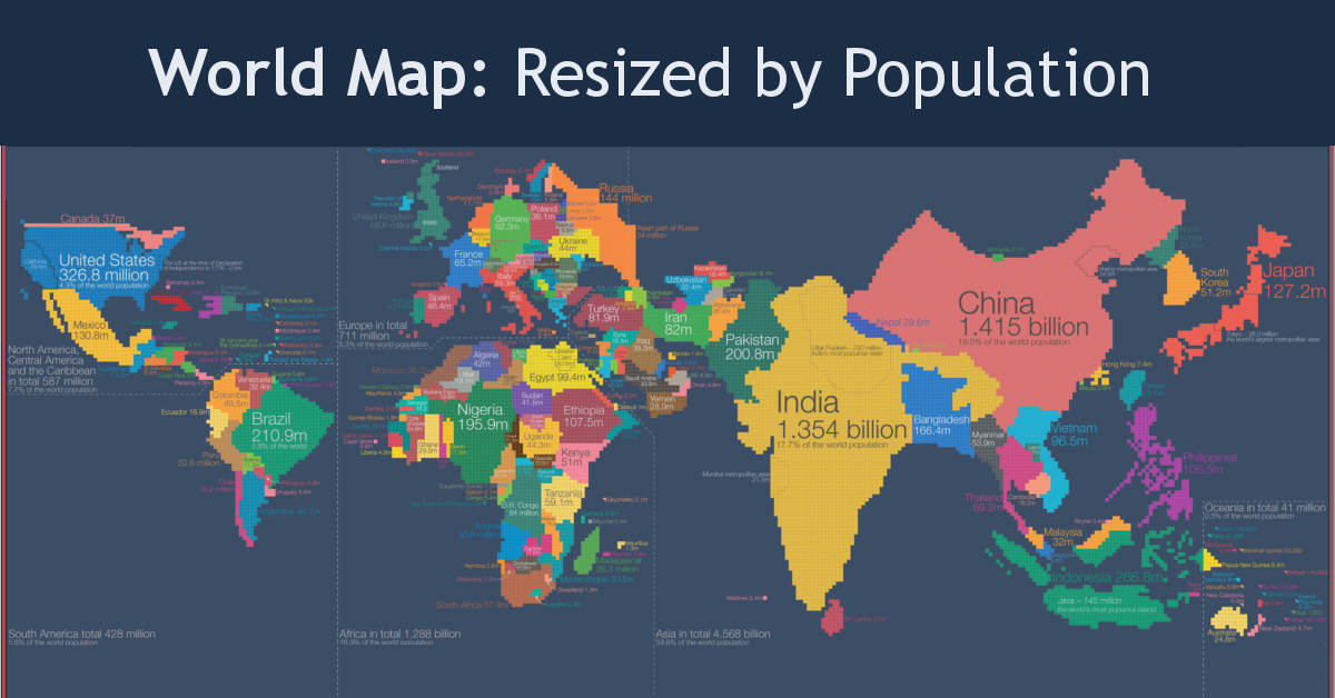
The following plot uses (distorts) the country sizes to represent the worldwide population. What kind of visualization (map) is this plot?

Genius is 99% perspiration and 1% inspiration