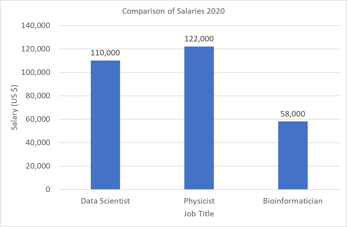
Consider the following salary data.
Data Scientist | Physicist | Bioinformatician
---------------|-----------|-----------------
$110,000       | $122,000  | $58,000
Make a graph of this data in Microsoft Excel similar to the following visualization.